Field Set Component Classic Styling

The Field Set component inserts an area where you can group multiple components together. When you group components using Field Set, you can apply the show or hide conditional settings to the group, instead of individually.
The Field Set Container that groups multiple components with a single conditional rule to show or hide them together. component is supported in the Input view and is found in the Formatting section of the Components tray.
To determine the logic behind the condition used in the Field Set component, consider it an if/then statement.
Example For example, IF (the Status field) has value Open, THEN (the condition is true and the components in the field set should be visible), and the Field Set displays. IF (the Status field) has value Closed, THEN (the condition is false, and the components in the field set should be hidden), and the Field Set does not display.
To set up a field set
-
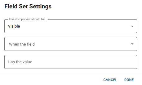
In the Input view, in the Components tray, under Formatting, drag the Field Set component to the canvas. The Field Set Settings window opens.
If you use the Classic Styling, these settings are set in a dialog that opens after you drop the component on the canvas. If you are using the Nexus Component Styling, these settings are set on the Properties tab after you drop the component on the canvas.
-
In the This component should be dropdown, select whether components added to the Field Set should be visible or hidden when the condition is met.
-
Select the field in the board from the When the field drop-down that will cause the condition to happen, making the Field Set visible or hidden.
-
Enter the value in the Has the value field that, when entered in the selected field, triggers the state specified in the This component should be field.
The value must be structured the same way as the field’s values. For example, if your field is a text input field, the value must match the field content exactly in terms of spelling, capitalization, and punctuation.
-
Click Done. A box displays with the message Drop Component Here.
-
Drag the components that should be included in the Field Set from the Component tray to the Drop Component Here box.
-
The Field Set component’s outline updates to orange when the component is positioned correctly. When you release the mouse, the settings window for that component opens, and you configure it as you would normally.
-
When you have added all the components to the Field Set, above the canvas, click Save to save the board.
Actions Toolbar
The following actions are available when you select any component on the canvas in the Board Workspace when working with Nexus Component Styling.
| Icon | Name | Description | Procedure |
|---|---|---|---|

|
Settings |
Opens the Properties tab next to the Components Tray. You can modify the component’s settings, such as label, database field name, help text, style, and conditional settings. |
|

|
Move |
|
This icon is not used. To move the component, click and drag it to its new location. |

|
Clone |
Copies the current component and its settings, then pastes it after the current component. |
|

|
Delete |
Deletes the selected component. |
|
Related Concepts