The HTML5 Content component provides a rich text editor that allows you to insert content such as formatted text, images, tables, and media onto your form.
This component does not require knowledge of HTML.
Example of HTML5 Content Rendered on a Form

Settings
The settings for each component are grouped under tabs. While there are multiple tabs and many fields, some are applicable to advanced users (for example, the API and Conditional tabs and JSON fields) and you do not need to complete them to render the component. For this reason, the settings that are necessary are detailed for each component. In some cases, when an optional field is frequently used, it is listed in a second optional settings table. For tabs and fields that are not listed, advanced users are assumed to have pre-existing knowledge of how to work with them if they elect to apply them; however, they should be aware that the fields may not be compatible with WebEOC. Contact the Juvare Support Center at +1 (877) 771-0911 for additional information.
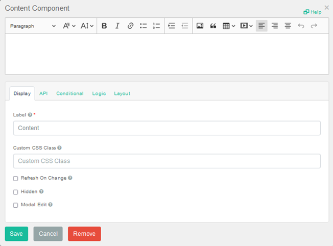
The following settings are necessary to render the component:
|
Field |
Description |
Procedure |
|---|---|---|
|
Label (Display tab) |
Text that identifies the component. This label does not appear on the form. | Unlimited alphanumeric characters, including special characters. |
|
Content
|
Rich text editor that allows you to add content such as formatted text, images, tables, and media onto your form. |
|
Icons
The following tool icons are available:
| Icon | Name | What it Does | Procedure |
|---|---|---|---|

|
Settings | Displays the settings window, in which you can modify the component’s settings. |
To modify settings
|

|
Move |
Moves the component to another position on the board. This option is useful with touch pages. If you are not using a touch page, you can drag the component to its new location. |
|


|
Copy Paste |
Copies the current component and its settings and pastes it after the current component. |
To copy the component
|

|
Remove | Removes the current component. |
To remove the component
|