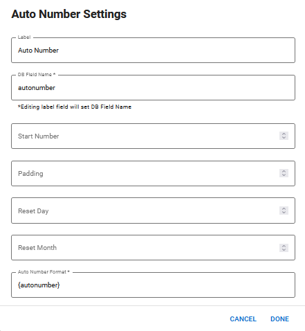
The Auto Number component adds an automatic numbering system that increments each time a record is created.
The Auto Number component is supported in the Input view.
On the canvas, the auto number appears as a random number that displays as an example of how the field will look.

Settings

The following settings are available.
| Field | Description | Procedure |
|---|---|---|
|
Label |
A unique identifier that briefly describes the component in the user interface. |
Enter a name. |
|
DB Field Name |
A unique identifier that briefly describes the component in the database table. The text in this field becomes the database field name. |
Enter a name. |
|
Start Number |
The first number before incrementation takes place. The default number is 1. |
Enter a number. |
|
Padding |
The numbers that are skipped when an incrementation takes place. For example, if you enter 1 and the starting number is 1, the numbers increment in this order: 1, 3, 5, 7, and so on. |
Enter a number. |
| Reset Day |
The day of the month when the counter resets. If you do not specify a number, the counter resets on the first of each month. |
Enter a number in a two-digit format. For example, 01 or 15. |
|
Reset Month |
The month in which the counter resets. If this field is used without the Reset Day field, the counter resets on the first day of the specified month. |
Enter a number in a two-digit format. For example, 01 or 11. |
|
Auto Number Format |
A custom format that is used for the auto number. For more information see <autonumber> in the WebEOC Nexus Admin Help Center. |
Enter <autonumber> tag information. |
Icons
The following tool icons are available.
| Icon | Name | Description | Procedure |
|---|---|---|---|
|
|
Settings |
Displays the settings window, in which you can modify the component’s settings. |
|
|
|
Move |
Moves the component to another position on the board. This option is useful with touch pages. If you are not using a touch page, you can drag the component to its new location. |
|
|
|
Delete |
Deletes the current component. |
|