

The Embed Content component allows you to load external web pages by copying and pasting an iframe tag. HTML Iframes are useful for inserting external content (such as images, videos, media, and so on) onto the dashboard. An iframe creates a wall between the host website and the third party as they do not have access to each other.
Dashboard views are available in DesignStudio Pro. Contact your Client Success Manager (CSM) for additional information.
The Email component is found in the Embed section of the Components tray.
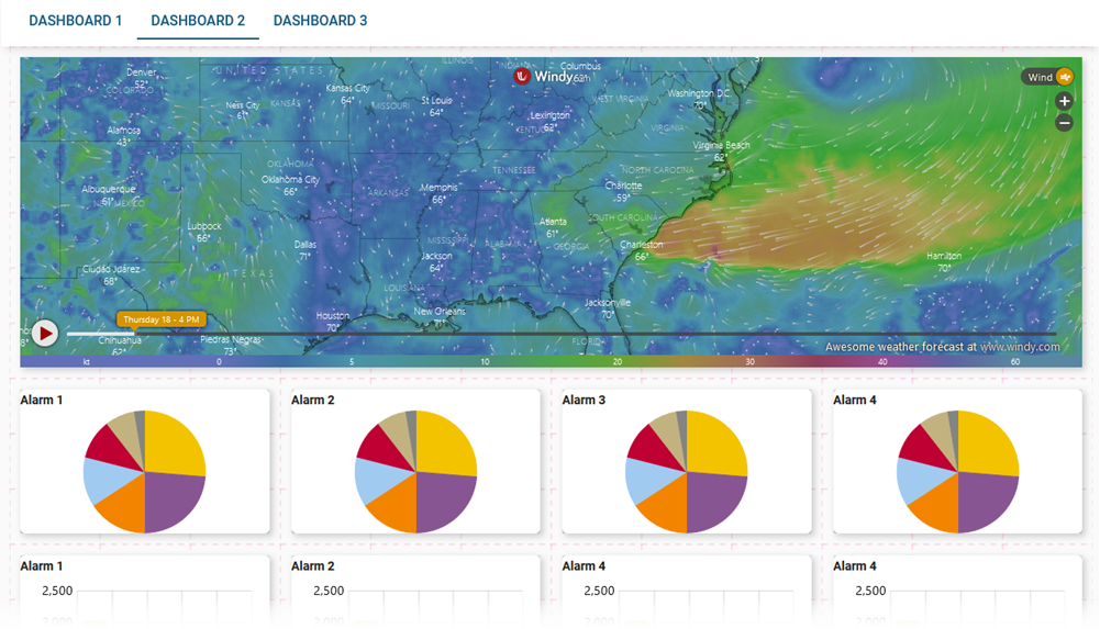
In the following graphic, a map from Windy.com is embedded as an iframe.
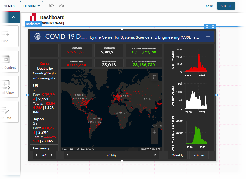
In the following graphic, an iframe from the Center for Systems and Engineering is displayed.
See Add Board Components for details about adding components to a view.
Settings
If you use the Classic Styling, these settings are set in a dialog that opens after you drop the component on the canvas. If you are using the Nexus Component Styling, these settings are set on the Properties tab after you drop the component on the canvas.
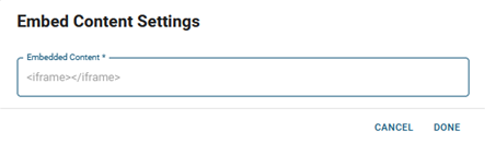
The following setting is available.
| Field | Description | Procedure |
|---|---|---|
|
Embedded Content |
Iframe HTML code that embeds the content. |
Websites often allow you to copy the code. Paste it into the Embedded Content field. |
Actions Toolbar
The following actions are available when you select any component on the canvas in the Board Workspace when working with Classic Styling.
| Icon | Name | Description | Procedure |
|---|---|---|---|

|
Settings |
Opens the Settings dialog. You can modify the component’s settings, such as label, database field name, help text, style, and conditional settings. |
|

|
Move |
|
This icon is not used. To move the component, click and drag it to its new location. |

|
Clone |
Copies the current component and its settings, then pastes it after the current component. |
|

|
Delete |
Deletes the selected component. |
|
Actions Toolbar
The following actions are available when you select any component on the canvas in the Board Workspace when working with Nexus Component Styling.
| Icon | Name | Description | Procedure |
|---|---|---|---|
|
|
Settings |
Opens the Properties tab next to the Components Tray. You can modify the component’s settings, such as label, database field name, help text, style, and conditional settings. |
|
|
|
Move |
|
This icon is not used. To move the component, click and drag it to its new location. |
|
|
Clone |
Copies the current component and its settings, then pastes it after the current component. |
|
|
|
Delete |
Deletes the selected component. |
|