Field Component Classic Styling

The Field component inserts a WebEOC field onto the canvas.
The Field component is supported in the Details view and is found in the Display Data section of the Components tray.

See Add Board Components for details about adding components to a view.
Settings
If you use the Classic styling, these settings are set in the Bar Chart Settings dialog. If you are using the WebEOC Nexus Styling, these settings are set on the Properties tab.
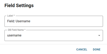
The following settings are available.
| Field | Description | Procedure |
|---|---|---|
|
Label |
A unique identifier that briefly describes the component in the user interface. |
Enter between 2 - 50 alphanumeric characters, excluding special characters. |
|
DB Field Name |
A WebEOC field to have the value rendered when you view the Details view. |
Select from the list of WebEOC fields that are associated with your board. |

Actions Toolbar
The following actions are available when you select any component on the canvas in the Board Workspace when working with Nexus Component Styling.
| Icon | Name | Description | Procedure |
|---|---|---|---|

|
Settings |
Opens the Properties tab next to the Components Tray. You can modify the component’s settings, such as label, database field name, help text, style, and conditional settings. |
|

|
Move |
|
This icon is not used. To move the component, click and drag it to its new location. |

|
Clone |
Copies the current component and its settings, then pastes it after the current component. |
|

|
Delete |
Deletes the selected component. |
|
Related Concepts