View Link Component
![]()
The Viewlink component inserts a link or button on the board that a user can click to open another view.
The View Link component is supported in the Input view, Details view, and List view.
Settings

Settings Tab
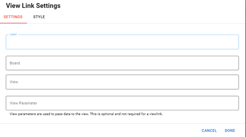
The following fields are available.
| Field | Description | Procedure |
|---|---|---|
|
Label |
The label that appears on the button. |
Enter between 2 - 50 alphanumeric characters, excluding special characters. |
|
Board |
The board that contains the view you want to link. |
Select a board from the list. If the board has a publish profile, you can select from a list of boards from your WebEOC instance. |
|
View |
The name of a view that exists for the board. The view does not need to be in DesignStudio. |
Select a view from the list. If the board has a publish profile, you can select from a list of boards from your WebEOC instance. |
| View Parameter | The parameter used to pass data to the view. |
When the user navigates to the view from the board, the data in the view parameter is passed to the view. Enter between 2 - 50 alphanumeric characters, excluding special characters. Once saved, in Code Mode, you can see the <viewparameter> tag with the content you entered in the View Parameter field. This parameter is optional. |
Style Tab
| Field | Description | Procedure |
|---|---|---|
|
Type |
The visual representation of the viewlink. |
Select one of the following options:
|
|
Button Size |
The size of the button. |
Select one of the following options:
|
|
Color |
The color of the button. |
Select one of the available colors. |
|
Select Icon |
The icon that appears on the button, after the Label. |
Select one of the available icons.
|
Icons
The following tool icons are available:
| Icon | Name | What it Does | Procedure |
|---|---|---|---|
|
|
Settings |
Displays the settings window, in which you can modify the view link settings. |
|
|
|
Move |
Moves the component to another position on the board. This option is useful with touch screens. If you are not using a touch screen, you can drag the component to its new location. |
|
|
|
Delete |
Deletes the current component. |
|