Card Component Classic Styling

The Card component allows you to drag and drop a card onto the canvas.
The Card component is supported in the List view and is found in the Data Visualization section of the Components tray.
Cards can contain plain text, a link to another view, or an expression.
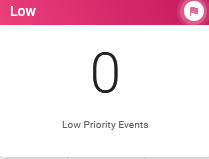
When you drag and drop a card, you can insert up to four cards side-by-side. If you insert a fifth card, it appears on the next row.
See Add Board Components for details about adding components to a view.
Settings
The following settings are available.
|
Field |
Description |
Procedure |
|---|---|---|
|
Title |
A unique identifier that briefly describes the component in the user interface. |
Enter the title that will display at the top of the card on the board. |
|
Sub Title |
A secondary title for the card. The subtitle displays below the title. |
Enter the subtitle that will display below the title on the card on the board. |
|
Expression Name |
The name of the expression you want to use for the card. This field displays when you select Expression for the Content Type. For information about expressions, see <expression> in the WebEOC Nexus Admin Help Center. |
Enter the expression name. |
|
Expression |
The expression that runs when the page is loaded. For information about expressions, see <expression> in the WebEOC Nexus Admin Help Center. |
Enter the expression. |
|
Board Level Filters |
Whether view filters applied at the board level are respected when calculating an expression. |
Turn the toggle on to use
board-level filters See Board, Group, and User Filters below for details. |
|
Group Level Filters |
Whether view filters applied at the feature group |
Turn the toggle on to use group-level filters See Board, Group, and User Filters below for details. |
|
User Level Filters |
Whether view filters applied at the user level are respected when calculating an expression. |
Turn the toggle on to use user-level filters See Board, Group, and User Filters below for details. |

Style
The following style options are available.
|
Field |
Description |
Procedure |
|---|---|---|
|
Accent Color |
The color that appears on the card. |
Select one of the gradient or solid colors. |
|
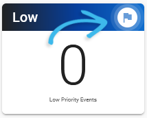
Icon |
The icon that indicates the type of card. This icon appears in the upper right of the card.
|
Search for and select the icon. |
Board, Group, and User Level Filters
When using expressions with the card component, you can set the expression to run on data filtered at different levels. These levels can be combined. For example, you can set an expression to run on data filtered at both the board and group levels.
If you select the Board Level Filters checkbox, data will be filtered using the active filters set at the board’s view filter level, visible in Configure mode. See Build a View Filter For a Display View for details.
Example In this example, the board-level filter of Removed is applied to the board data before an expression runs.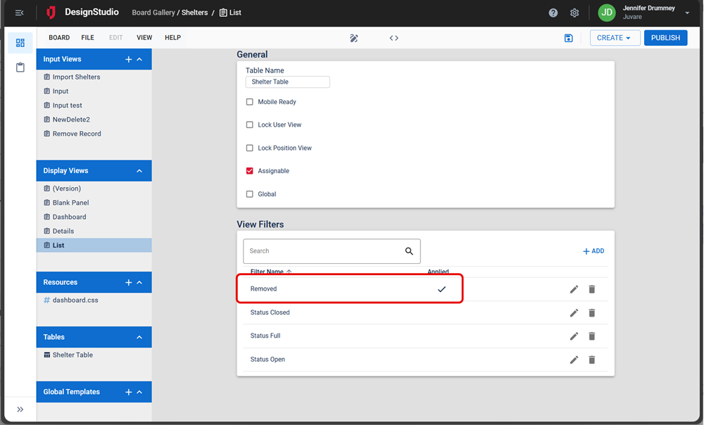
If you select the Group Level Filters checkbox, data will be filtered using the view filters set for the feature group assigned to the board in WebEOC.
Example For example, the Shelters board is assigned to the Shelters – Admin feature group. The board’s view filter for that group is set on the Edit Board window. In this example, the Active Requests filter will be applied to the board data before the expression runs for all members of this feature group.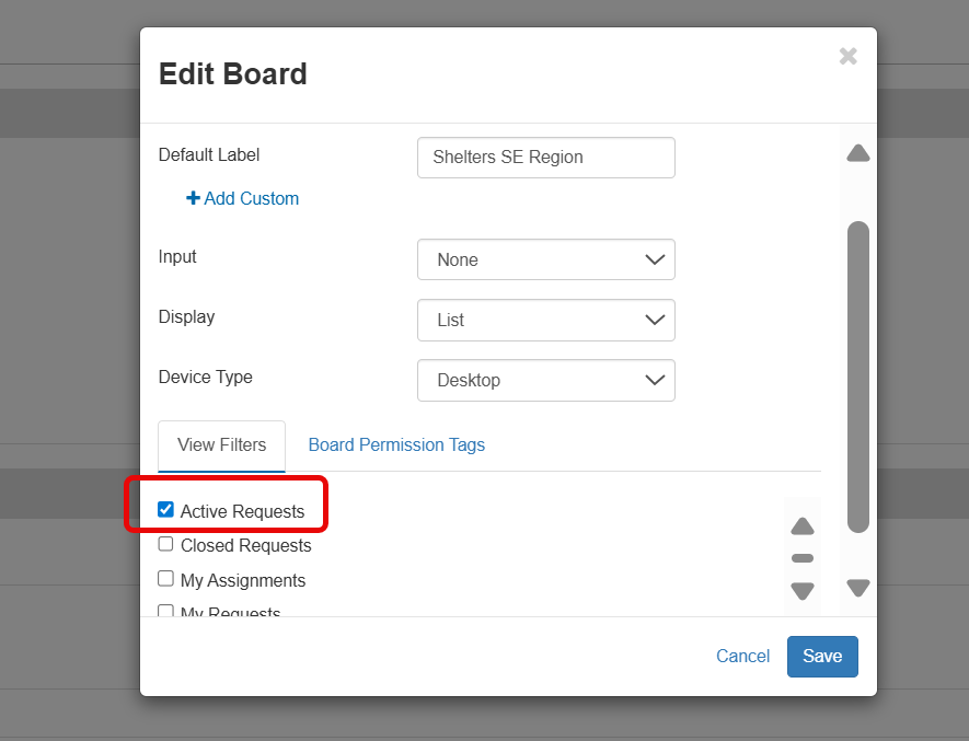
If you select the User Level Filters checkbox, data will be filtered using any filters the user has set while using the board in WebEOC. Filters could include selections the user makes in dropdowns, or selections made using the Filter button.
Example In this example, the Full filter the user selected will be applied to the board data before the expression runs.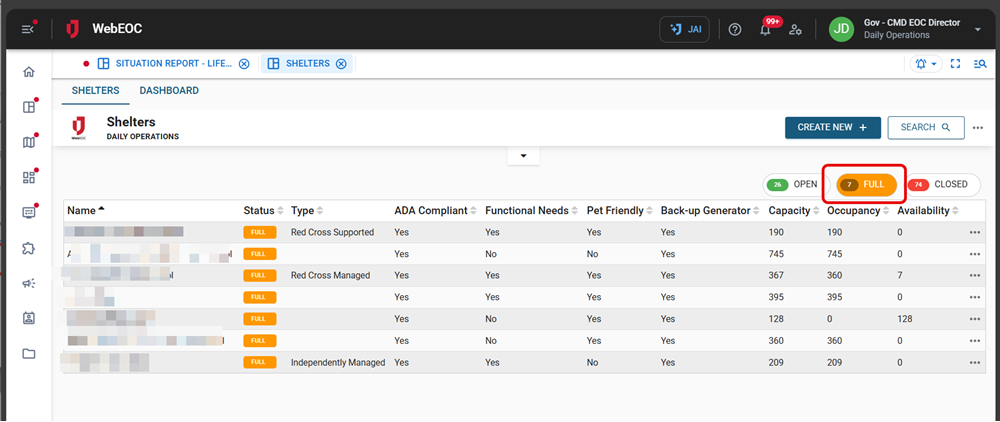
Actions Toolbar
The following actions are available when you select any component on the canvas in the Board Workspace when working with Nexus Component Styling.
| Icon | Name | Description | Procedure |
|---|---|---|---|

|
Settings |
Opens the Properties tab next to the Components Tray. You can modify the component’s settings, such as label, database field name, help text, style, and conditional settings. |
|

|
Move |
|
This icon is not used. To move the component, click and drag it to its new location. |

|
Clone |
Copies the current component and its settings, then pastes it after the current component. |
|

|
Delete |
Deletes the selected component. |
|
Related Concepts