
The image component inserts an image that you have added as a resource to the board.
This component is supported in the Input and Display views.
See Add Board Components for details about adding components to a view.
Settings
The following settings are available.
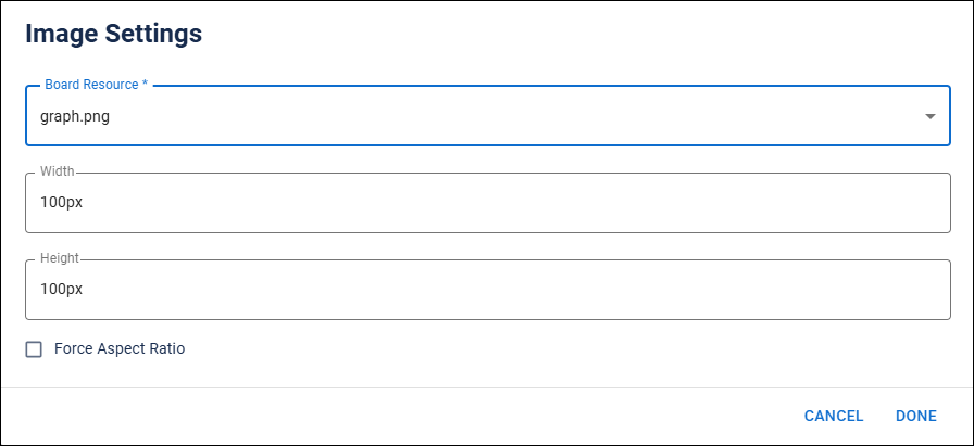
| Field | Description | Procedure |
|---|---|---|
|
Board Resource |
Name of the image file that has already been added to the board. |
Select the image file. See Add a Resource to a Board for details. |
|
Width |
Width of the image on the board. |
Enter a width for the image. |
| Height | Height of the image on the board. | Enter a height for the image |
| Force Aspect Ratio | Setting to control the dimensions of an image, ensuring that it maintains a specific width-to-height ratio regardless of the size changes. | Select the checkbox to enable the option. |
Actions Toolbar
The following actions are available when you select any component on the canvas in the Board Workspace.
| Icon | Name | Description | Procedure |
|---|---|---|---|
|
Settings |
Opens the Settings dialog. You can modify the component’s settings, such as label, database field name, help text, style, and conditional settings. |
|
|
Move |
|
This icon is not used. To move the component, click and drag it to its new location. |
|
Clone |
Copies the current component and its settings, then pastes it after the current component. |
|
|
Delete |
Deletes the selected component. |
|