The Multiple Files component allows you to drag and drop a field on to the canvas.
The Multiple Files component is supported in the Input view and the Details view.
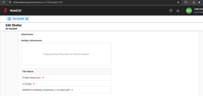
When you add the Multiple Files component to a board, a field on the board displays that allows users to either drag and drop or click to browse to upload multiple files. Once uploaded, these files can be downloaded, replaced, or deleted.
This component is available for use with WebEOC Nexus 10.9 and later.
Here is the component as it appears in an Input view on a board, with a section to drag and drop or click to upload, and a list of files already attached beneath it. You can delete files in this view.
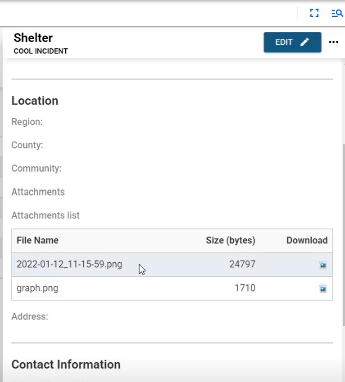
When added to a Details view, the file name, file size, and a download icon display.
Settings
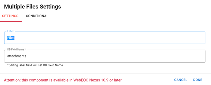
The following settings are available.
| Field | Description | Procedure |
|---|---|---|
|
Label |
A unique identifier that briefly describes the component in the user interface. |
Enter between 2 - 50 alphanumeric characters, excluding special characters. |
|
DB Field Name |
A unique identifier that briefly describes the component in the database table. The text in this field becomes the database field name. |
Enter between 2 - 50 alphanumeric characters, excluding special characters. |
|
Conditional Settings |
The component only appears when certain conditions in relation to another component are met. |
Icons
The following tool icons are available.
| Icon | Name | Description | Procedure |
|---|---|---|---|
|
|
Settings |
Displays the settings window, in which you can modify the component’s label, database field name, and conditional settings. |
|
|
|
Move |
Moves the component to another position on the board. This option is useful with touch pages. If you are not using a touch page, you can drag the component to its new location. |
|
|
|
Copy |
Copies the current component and its settings and pastes it after the current component. |
|
|
|
Delete |
Deletes the current component. |
Click the Delete icon. |


