Date/Time Component Nexus Component Styling

The Date/Time component inserts a date and time field on the canvas.
The Date/Time component is supported in the Input view and is found in the Data Entry section of the Components tray.

See Add Board Components for details about adding components to a view.
Settings
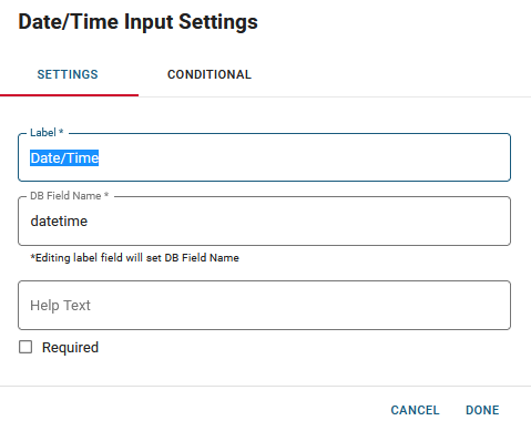
The following settings are available.
| Field | Description | Procedure |
|---|---|---|
|
Label |
A unique identifier that briefly describes the component in the user interface. |
Enter between 2 - 50 alphanumeric characters, excluding special characters. |
|
DB Field Name |
A unique identifier that briefly describes the component in the database table. The text in this field becomes the database field name. |
Enter between 2 - 50 alphanumeric characters, excluding special characters. |
|
Help Text |
The tooltip that appears when the pointer is over the field. |
Enter between 2 - 50 alphanumeric characters, excluding special characters. |
|
Required |
Indicates that the component is a required field. The user sees an error message if the field is not completed. |
Select the checkbox to enable the option. |
|
Conditional Settings |
The component only appears when certain conditions in relation to another component are met. |
Actions Toolbar
The following actions are available when you select any component on the canvas in the Board Workspace when working with Classic Styling.
| Icon | Name | Description | Procedure |
|---|---|---|---|

|
Settings |
Opens the Settings dialog. You can modify the component’s settings, such as label, database field name, help text, style, and conditional settings. |
|

|
Move |
|
This icon is not used. To move the component, click and drag it to its new location. |

|
Clone |
Copies the current component and its settings, then pastes it after the current component. |
|

|
Delete |
Deletes the selected component. |
|
Related Concepts