Using the Operations View Map
The map in the Operations View module has panes and menus used to modify or work with the map. The following table describes these elements.
| Element | Description |
|---|---|
|
Map |
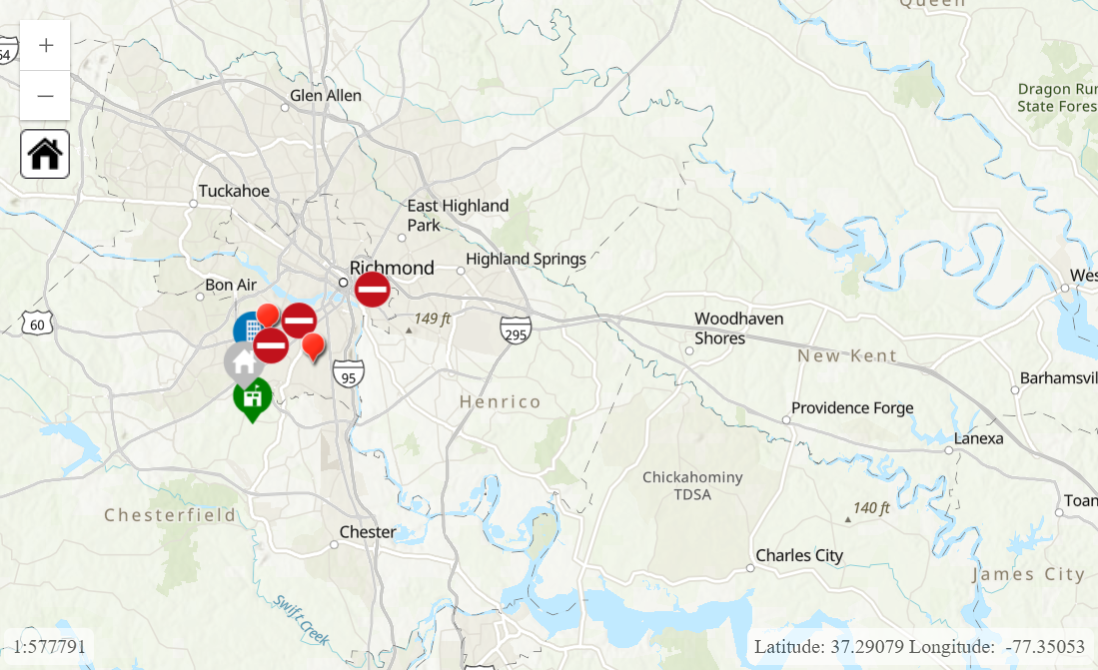
Displays aggregated data for your administrative region.
You can click map elements like entries to view more information about them. Clicking the home icon The numbers in the lower left indicate the map's scale, which changes as you zoom in or out. You can also set the scale by clicking these numbers and entering a value. The numbers in the lower right indicate the coordinates for the location where your cursor is positioned. By default, the coordinates are displayed as latitude and longitude, but you can select other units with the Map Settings feature in the Tools menu. By default, if there are many data points for certain types of data, those data points are grouped as cluster pins. For example, when many entries are close together on the map, the group of entries is represented by a red cluster pin. The number on the pin indicates how many entries it contains. If a pin contains less than 5,000 entries by default, you can click it to expand the cluster and display each entry. You can also zoom in to a smaller area with fewer entries to view the individual entries in that area. Structures and reentry permits are clustered in the same way as entries, except the pins are different colors as indicated in the left pane. In the Settings module, administrators can enable or disable clustering, set the maximum number of data points in a cluster, and set the maximum number of data points for click-to-expand functionality. |
|
Left Pane |
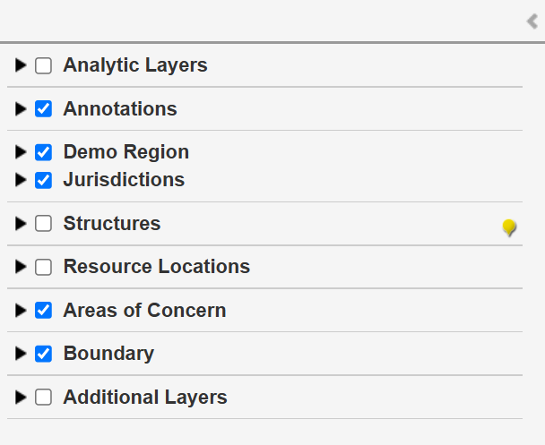
Allows you to show or hide map elements representing the following types of data. You can expand or collapse the left pane by clicking the expand icon
|
|
Bottom Pane |
Displays timelines of the employee labor and equipment usage. You can expand or collapse the bottom pane by clicking the expand icon
Use the menu on the lower right to choose whether to display employee or equipment data. Each row represents an employee or piece of equipment. The blue bars indicate time periods when the employee was working or the piece of equipment was being used. You can hover your cursor over a bar to show the exact start and stop times. The slider changes the scale of the timeline, letting you focus on specific months, weeks, or days. You can enter a specific date to focus the timeline on that date, and you can click the arrows at the end of the slider to scroll the timeline forward or backward in time. If you want to filter for specific employees or equipment, use the search bar in the lower right. The timeline displays any employees or equipment whose names include the entered text. |
|
Right Pane |
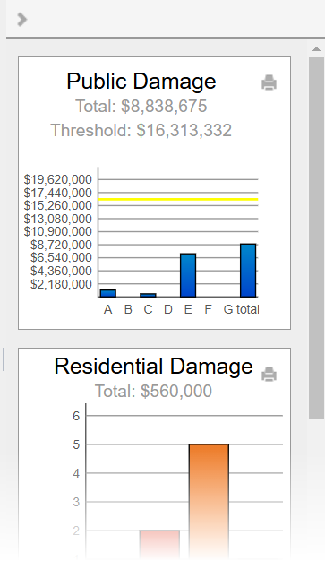
Displays charts summarizing data from damage assessment entries. You can expand or collapse the right pane by clicking the expand icon
These charts are also displayed in the Charts module. For information about these charts, see View Damage Assessment Charts. |
|
Search Bar |
Allows you to search for specific entries.
When you enter your search terms, Crisis Track searches through in all the text fields in entries for this incident. Entries with matching text appear in the left pane. You can click an entry to view more information about it, or you can click the zoom icon |
|
Tools Menu |
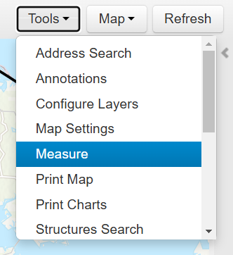
Allows you to edit or work with the map in various ways, such as adding elements, changing the map settings, or measuring distances. For more information, see Using the Operations View Map Tools.
|
|
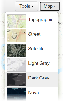
Map Menu |
Allows you to change the appearance of the base map. This does not affect other map elements.
|
