Create a List View Classic Styling
A List view is referenced by the board so that it can load the data. DesignStudio provides tools to add components to enhance this view.
When you are working in the WebEOC Nexus Styling version of this view, the View Header Component that inserts a section header organizing and visually separating content areas. replaces the App Bar at the top of the canvas.
You can also create a List view by copying a view.
After you create a List view, update it using the following components:
-
List View Settings: Enable export options, comments and share buttons
Component that displays a button giving users access to Share Links for generating direct URLs., and add associated views. -
Map Configuration: Configure the map settings for the List view.
-
Status Indicators: Define how icons and colors display for fields on boards to indicate a record’s status.
-
Table Fields: Update field configurations for List views.
To create a List view
-
In the Board Gallery, locate the board for which you want to create a List view, and then click Design.
-
On the upper right, click Create > List View. The List View Configuration page opens.
-
Enter the following information, and then click Next.
List View configuration fields Field Description Procedure Use Nexus Component Styling Indicates which type of components will be used on this view. To use the Nexus Component Styling for components, select the Use Nexus Component Styling checkbox.
To use components from DesignStudio 2.5 and earlier, also called Classic Styling, leave the checkbox unselected.
Add to View Tab Group
Adds a tab to the top of the board that lets you switch between board views.
To add a tab, select the checkbox.
List View Name
The name for the List view.
Enter a name.
Associated Input View
The Input view that is associated with this List view.
Select from the list of available Input views.
Associated Details View
The Details view that is associated with this List view.
Select from the list of available Details views.
Associated Delete View
The Delete view that is associated with this List view.
Select from the list of available Delete views.
Associated History View The History view associated with this List view. See Create a History View Nexus Component Styling for details.
This drop-down only displays if you are using Nexus Component Styling.
Select a History view. Row Count
The number of records that appear on each page.
Enter a number or use the arrows to select a number.
Use 0 to display all of the records.
Order By
The column/field that will be used to sort the records.
Select a placeholder from the list.
Direction
How the records will be sorted.
Select either Ascending or Descending.
-
Click Next. The Card Table Configuration page opens. Configure these settings:
-
Select the Has standard Last Updated column checkbox to insert the Last Updated system field automatically for each row.
-
Select the Has Card Table Status Indicator checkbox to enable a color and icon indicator on each row on the List view based on a status field value.
This status indicator
Visual element using color and icon to display a record's status on a list view based on its value. displays at the row level. 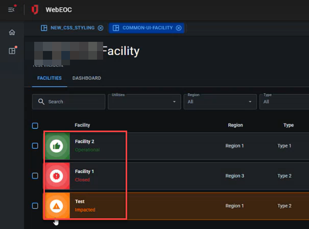
You can also configure field-level status indicators. See Status Indicators Component Nexus Component Styling for details.
If you select this checkbox, continue this configuration by:-
In the Status Field Name for row status indicator drop-down, select the field on the board that contains the value for the status.
-
In the WebEOC List Name for status indicator color field, enter the name of the list in WebEOC that stores the color for all status indicators.
-
In the Icons for row status indicator section, a list of statuses and their assigned icons displays. You can add a new status indicator icon by clicking +Add New and entering the status value and the icon name, then clicking the checkmark.
-
-
-
Click Next.
-
On the Field Configuration page, from the Field List, drag all the components you created in your board that you want to display in your List view into the Selected Fields area.
-
In the Label field, update the field name if needed,
-
Turn the Mobile toggle on or off, depending on whether the field should display in the mobile view.
-
Click Submit.
Related Concepts
Create a List View Classic Styling
Related Tasks
Add a Filter and/or Search Button to a List View Classic Styling
Edit a Collapsible Embedded Map Classic Styling
Assign a Delete View to a List View Classic Styling
Update the View Header for a List View Nexus Component Styling
Table Fields Settings Component Nexus Component Styling
Map Configuration Component Nexus Component Styling