Create and Edit Input Views
The Board Editor page allows you to visually design and edit data entry (Input) views that users can use to enter data.
This procedure is used with the Create a Board procedure.
You can also create and edit Input views in DesignStudio.
To create a board Input view
-
In the main menu, click the workflows icon
 . The Workflows page opens.
 -
On the Boards tab, click the name of the board you want to add the Input view to. The Board: Edit Board page opens.
-
In the Edit section, click Board Editor. The Board Editor: [Board Name] page opens.
-
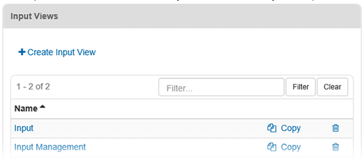
In the Input Views section, click Create Input View. The New Input tab opens.
-
Alternatively, if you want to create a board Input view from an existing view, click the existing view's associated Copy link. See Copy a View.

-
-
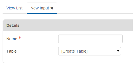
For Name, enter or modify the Input view name.

-
For Table, select a table from the drop-down list. Alternatively, to automatically generate a table, click Create Table.
-
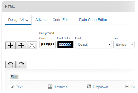
In the HTML section, go to the Design View tab. For help using the Advanced and Plain Code Editors, see HTML Conventions.

-
The Design View tab of the HTML section includes four components:
Cell formatting tools

Undo and Redo buttons

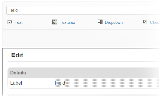
Field types and properties editing

Design pane
Use this pane to create the Input view design, assign cell and formatting properties, and view a visual representation of the Input view.
-
Begin constructing the Input view layout by selecting one of the baseline cell's label and field and applying the Split Horizontal, Split Vertical, or Merge button. You must have a cell selected in order to apply the operation.

-
To create a horizontal cell, select a cell and click the Split Horizontal button.
-
To create a vertical cell, select a cell and click the Split Vertical button.
-
To merge cells into a single cell, hold down the CTRL key, click adjoining cells to form a rectangle, and click the Merge button.
-
Merging cells deletes some of the merged content of the selected cells as part of the process.
-
-
Continue to split and merge cells until you get the layout you want. Once you have the layout constructed, you are ready to assign the field type and properties to each cell.

-
If the cell is to be used as a label in the Input view:
-
Select the cell.
-
Enter a name for the label in the cell content's text field.
-
Click Apply. The label appears in the Label cell.
-
-
If the cell is to be used as a data field in the Input view:
-
Select the cell.
-
Select the appropriate field type (for example, Text, Textarea, Dropdown, or Checkbox).
-
Select the cell with the field that was created to display additional field options.
-
In the field properties section, enter a unique name for the field (this will be used in the database).
-
Ensure all field name declarations are unique so you can easily identify them when building your Input view.
-
-
Define the field Size and Value, if needed.
-
Click Apply.
-
It is a good practice to periodically save the view as you are working on it. Saving allows you to revert back to a previous version at any time using the History feature.
-
-
Select the cell.
-
Click a field type, and set any additional cell properties required. The type of field selected determines the field properties available.
-
-
Text: Displays a single line of text. Set additional cell values for the text field.
-
Textarea: Displays multiple lines of text. A scroll bar is available to view inputs that exceed the row count set for the field. Set additional cell values for the Textarea field.
-
Dropdown: Presents a drop-down list of items. Set additional cell values and specify the list to be used.
-
Checkbox: Allows a user to mark a selection or selections. Set the value for the checkbox (for example, Yes).
-
After you have configured the cell label and field, edit the appearance by using the cell formatting tools.
-
You can also choose not to alter the default appearance as a standard format is already applied.
-
Select the cell.
-
If you wish to apply changes to multiple cells, hold the CTRL button and select the applicable cells.
-
-
To change the background color of a selected cell, click the Background Color field and enter a hexadecimal color code or choose the color from the palette. Click Apply.
-
To change the text color of the selected cell, click the Font Color field and enter a hexadecimal color code or choose the color from the palette. Click Apply.
-
To set the font for the text, open the Font drop-down list and click the font name.
-
To set the size for the text, open the Size drop-down list and click the point size for all selected cells.
-
Set the style for the text by clicking (B) Bold, (I) Italic, or (U) Underlined for the selected cell.
-
To set the text horizontal alignment, click Left Justify, Center Justify, or Right Justify.
-
For Vertical Align, set the vertical alignment for the text in the cell by selecting Top, Middle, Bottom, or Default.
-
The Default alignment setting relates to the alignment specified through the HTML written in an external editor and imported to a board. The default setting in this case can be overwritten by clicking Top, Middle, or Bottom in the Board Editor.
-
-
To set the width of the cell, for Width, enter a number with a unit and click Apply.
-
Valid units include the percent symbol (%), inches (in), centimeters (cm), or pixels (px).
-
-
-
Click Save.
Refer to Board Tags and Attributes for detailed information about tags that can be added to enhance functionality in the view.
Related Concepts
Related Tasks